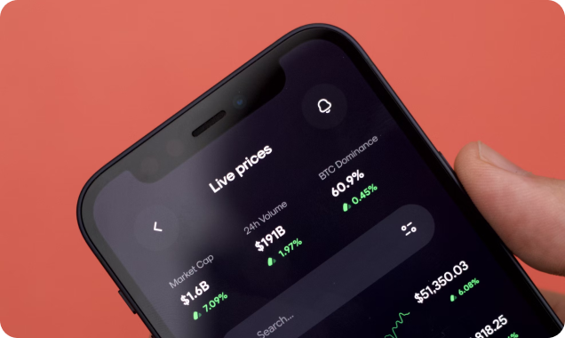
Mendero fintech dashboard design
-
Client
Mashorom
-
Category
User Experience
-
Tools
Figma, Webflow
-
Start
date
09/01/ 2020
-
End
date
09/01/ 2020
Overview
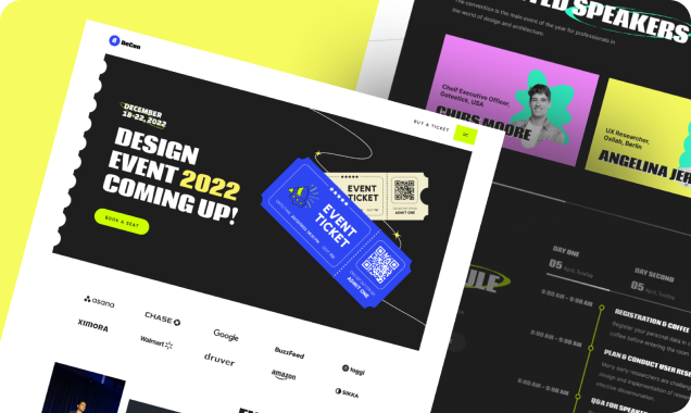
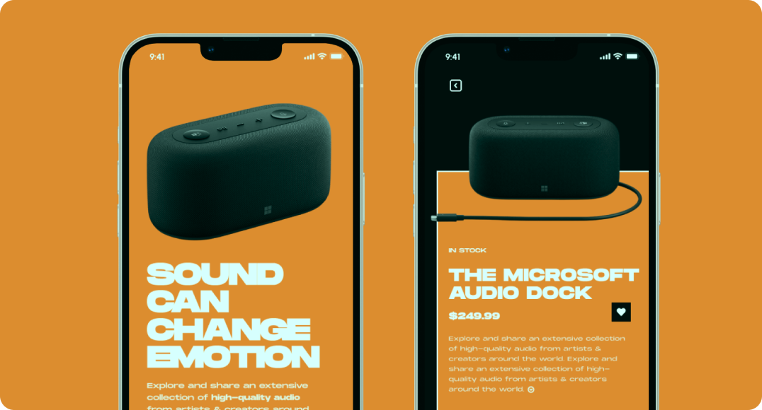
Minimalism combined with elements of french typography and brutalism helped us to realize the site exactly as we imagined with the client at the beginning: visually restrained, but stylish. Informative and pleasant to use, with an elegant aftertaste of a serious financial institution. Combined with elements of french typography and visually restrained, but stylish. Informative and pleasant to use, with an elegant aftertaste of a serious financial institutional client, and close collaboration.
That is where I come in. A lover of words, a wrangler of copy. Here to create copy that not only reflects who you are and what you stand for, but words that truly land with those that read them, calling your audience in and making them want more.
- Advantage
- Accomplished
- Marketplace startups
- SaaS startups
Typography
The basic idea was to find a balance between the thin, wispy sans-serif used to indicate a ‘futuristic‘ tone, and a bold, masculine font synonymous with ‘construction‘. We came up with something in the middle, leaning towards lighter-weighted fonts, but still with a hint of that blocky ‘construction’ vibe. We use Chaney for general display and when we want to drive attention to the content, and the technical and geometric Sora font for the body copy and paste overall hierachy.
Conclusion
The basic idea was to find a balance between the thin, wispy sans-serif used to indicate a ‘futuristic‘ tone, and a bold, masculine font synonymous with ‘construction‘. We came up with something in the middle, leaning towards lighter-weighted fonts, but still with a hint of that blocky ‘construction’ vibe. We use Chaney for general display and when we want to drive attention to the content, and the technical and geometric Sora font for the body copy and paste overall hierachy.
The basic idea was to find a balance between the thin, wispy sans-serif used to indicate a ‘futuristic‘ tone, and a bold, masculine font synonymous with ‘construction‘. We came up with something in the middle, leaning towards lighter-weighted fonts, but still with a hint of that blocky ‘construction’ vibe.


